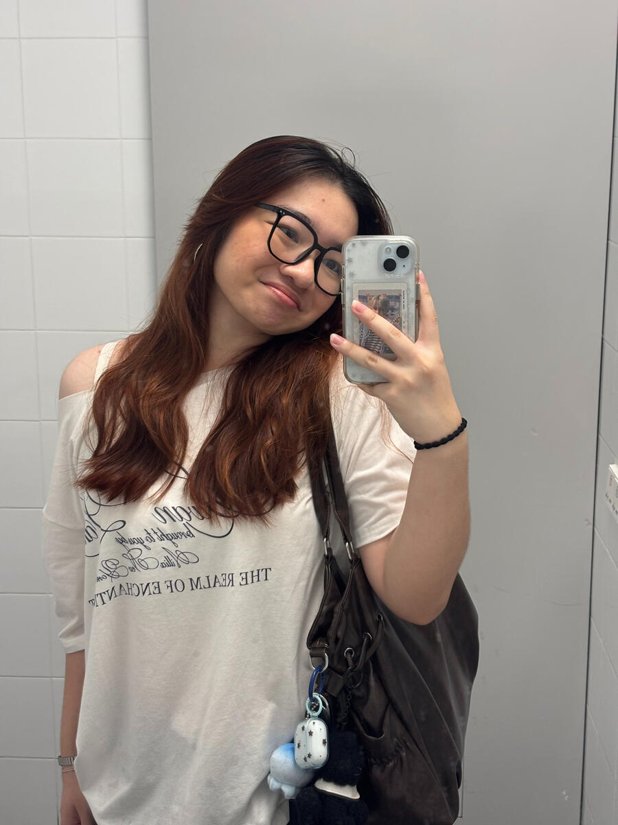
Sylvia's website
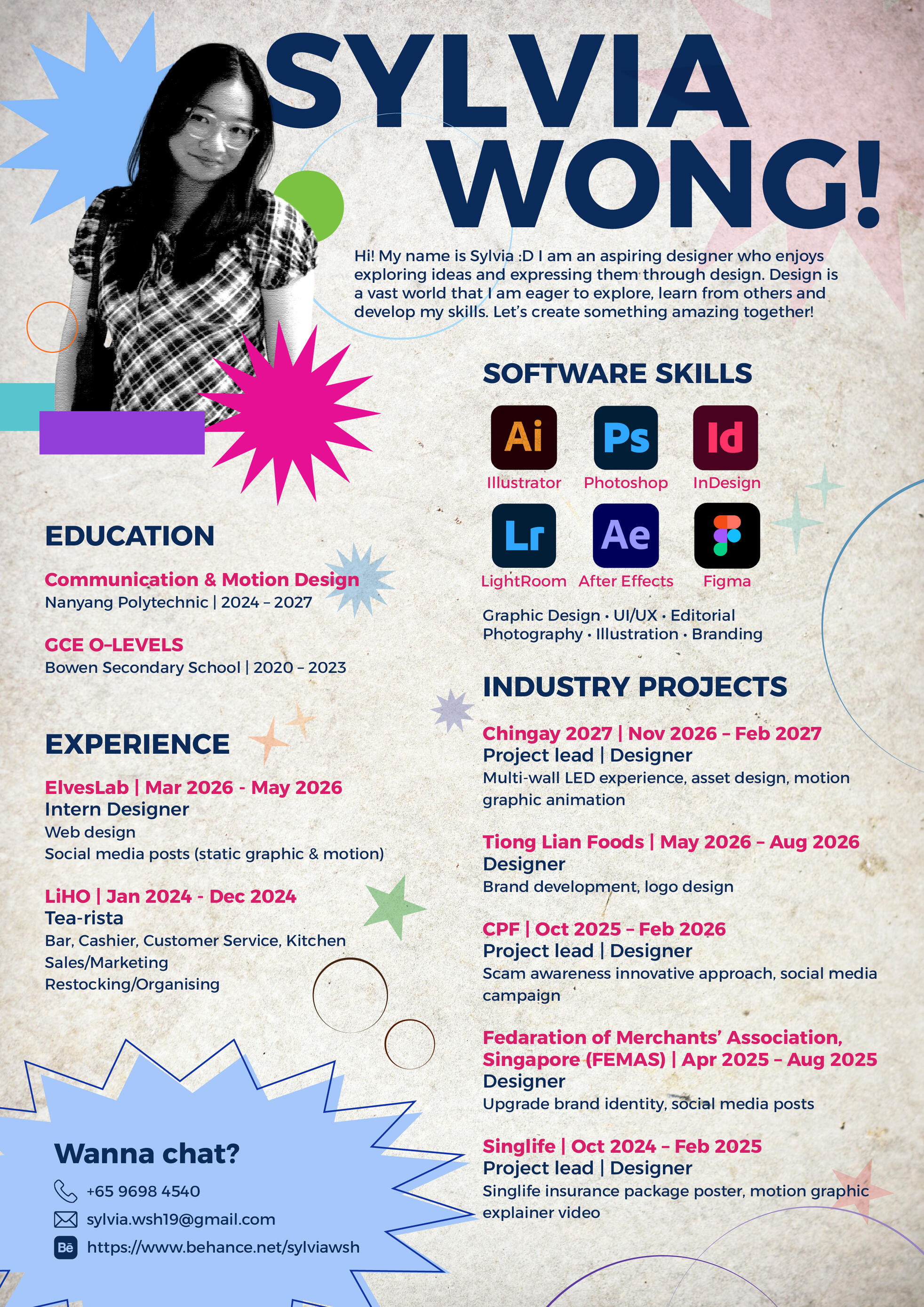
Hi! My name is Sylvia :D I am an aspiring designer who enjoys exploring ideas and expressing them through design. Design is a vast world that I am eager to explore, learn from others and develop my skills. Let’s create something amazing together!

mobile no.: +65 9698 4540
email: [email protected]
behance: https://www.behance.net/sylviawsh
linktree: https://linktr.ee/sylvia.wsh19
TO US - fan-made album concept poster
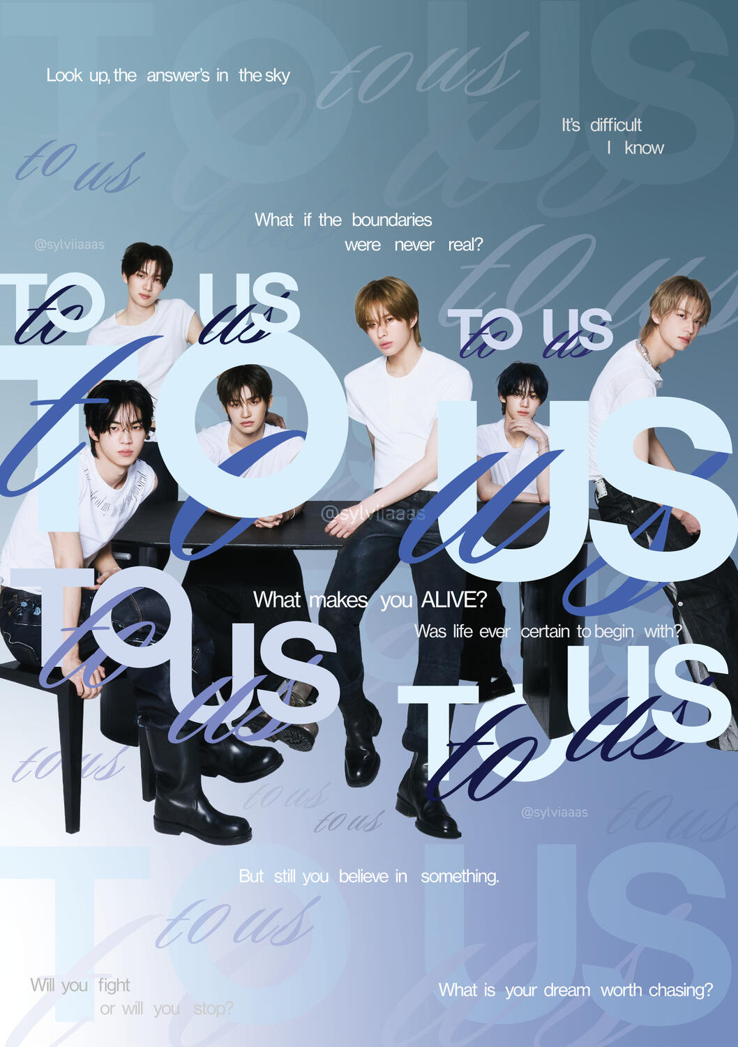
This album is about six youths who venture into a world of uncertainty and unsure of their place in the world. As they struggle together, they find refuge and comfort in the people around them, including each other.The quotes are from the 'Call My Name' music video, tied in with a wall of "to us" (album name) spread around the background. It's like a whisper, there in the back of your mind, doubt.This poster symbolises that even though life can be unpredictable and chaotic, and that all the uncertainty may make us doubt ourselves, know that everyone is capable of making great things, as long as you believe. in this vast world, you are not alone."Won't you call my name? So i don't lose my way."
TWS '24/7:for:you' Tour in Singapore fan support - personal project
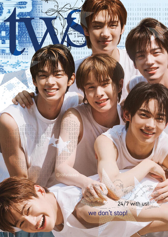
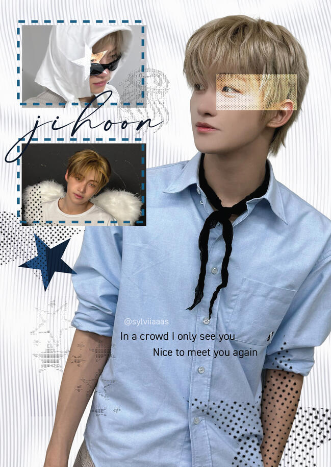
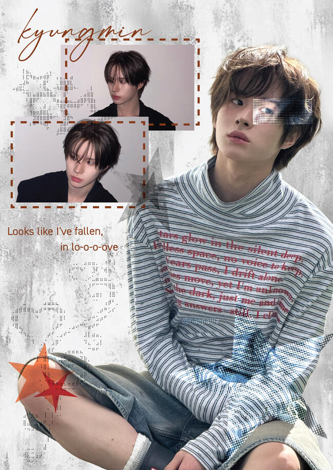
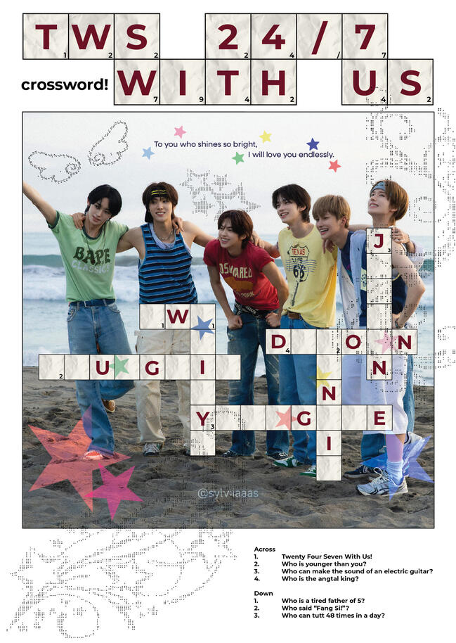
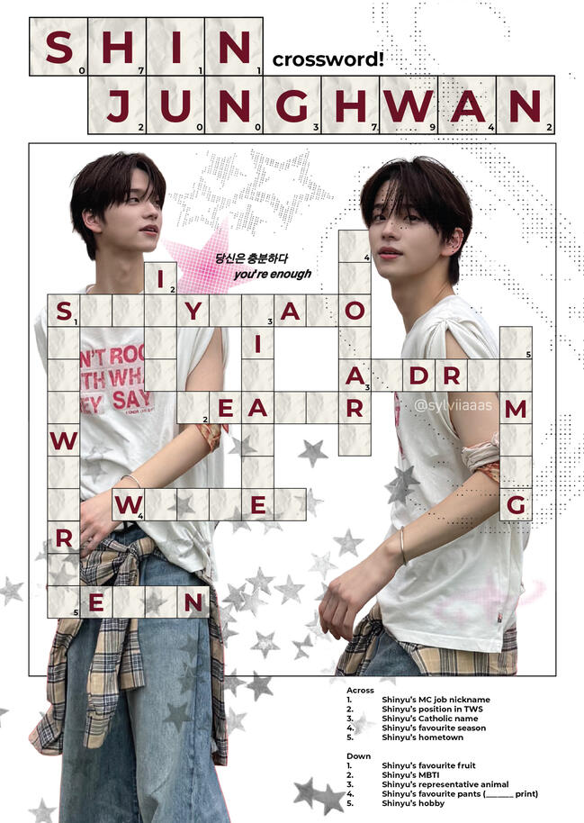
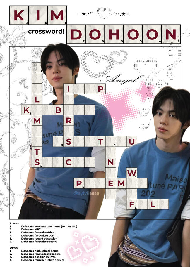

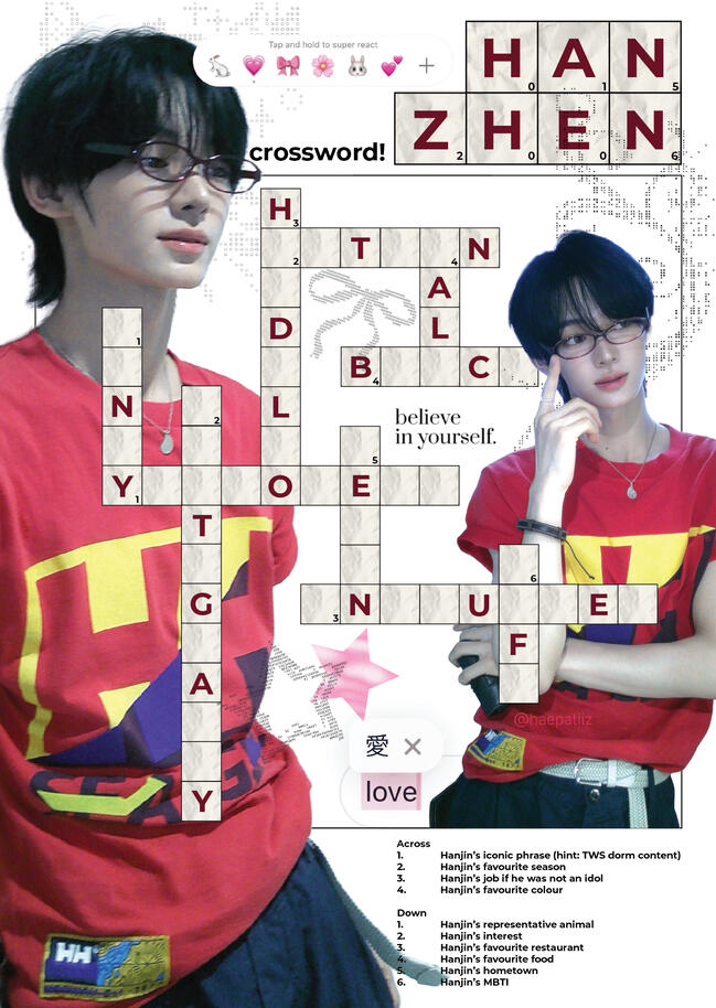
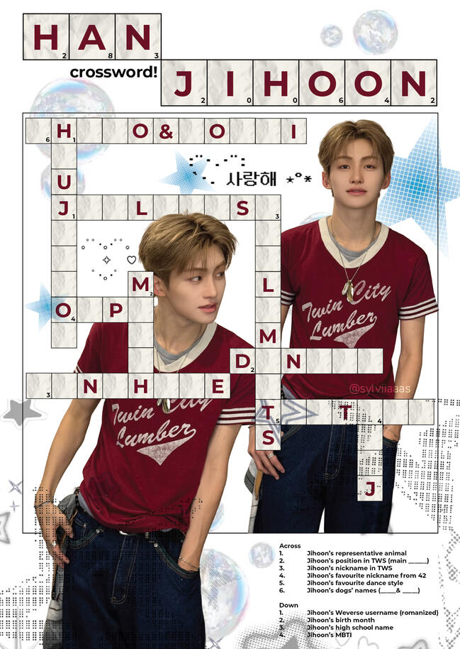
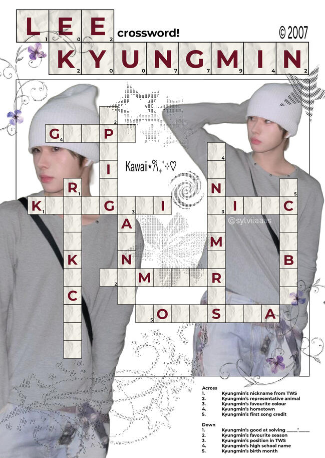
I created this collection of postcards as a personal fan-support project for TWS's concert in Singapore. these A6-size postcards encapsulates the members through a series of playful and expressive graphic prints. The designs explore a scrapbook-inspired aesthetic, combining layered photographs, handwritten typography, decorative doodles, textures and graphic elements. These elements come together to create a youthful and nostalgic visual style that reflects the fun and vibrant energy of the group.
Through experimenting with different layouts, typography and visual elements, I aimed to create a cohesive yet varied collection of postcards that fans could enjoy as keepsakes and a form of support for the group. The crossword in particular, includes actual facts about the members that fans could fill in, with the help of the hint's given at the bottom.
CORTIS member profile cards - personal project
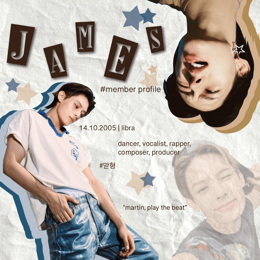
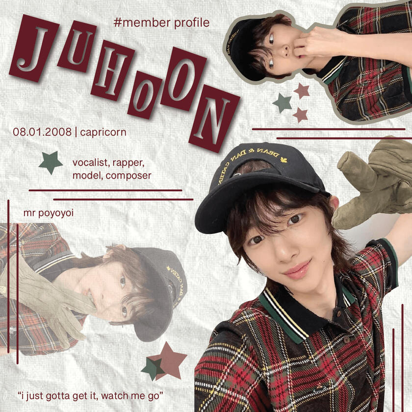
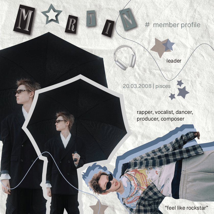
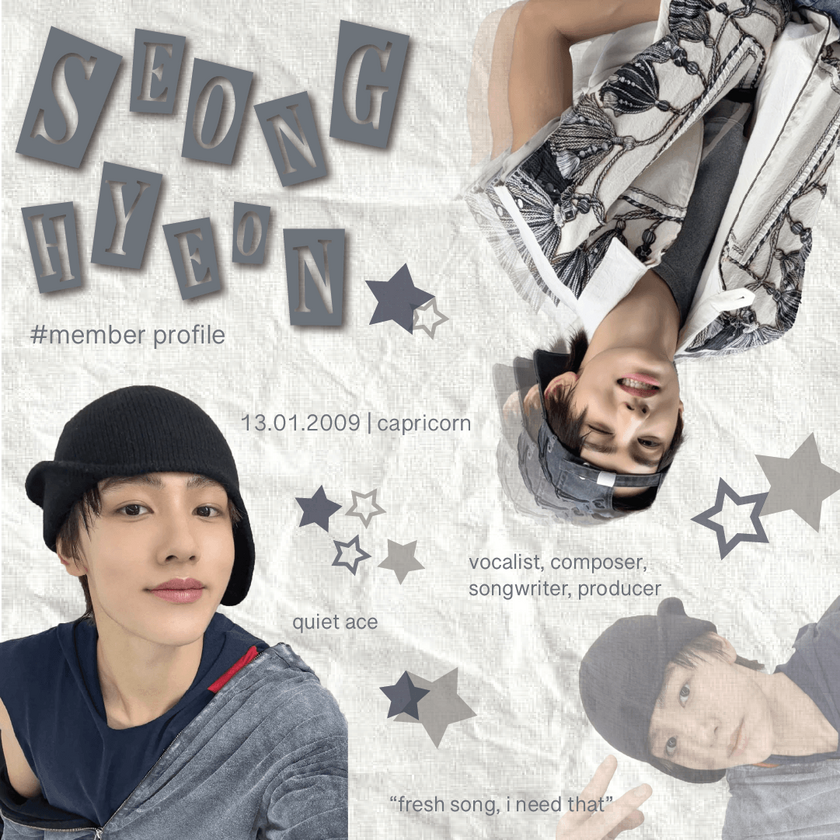
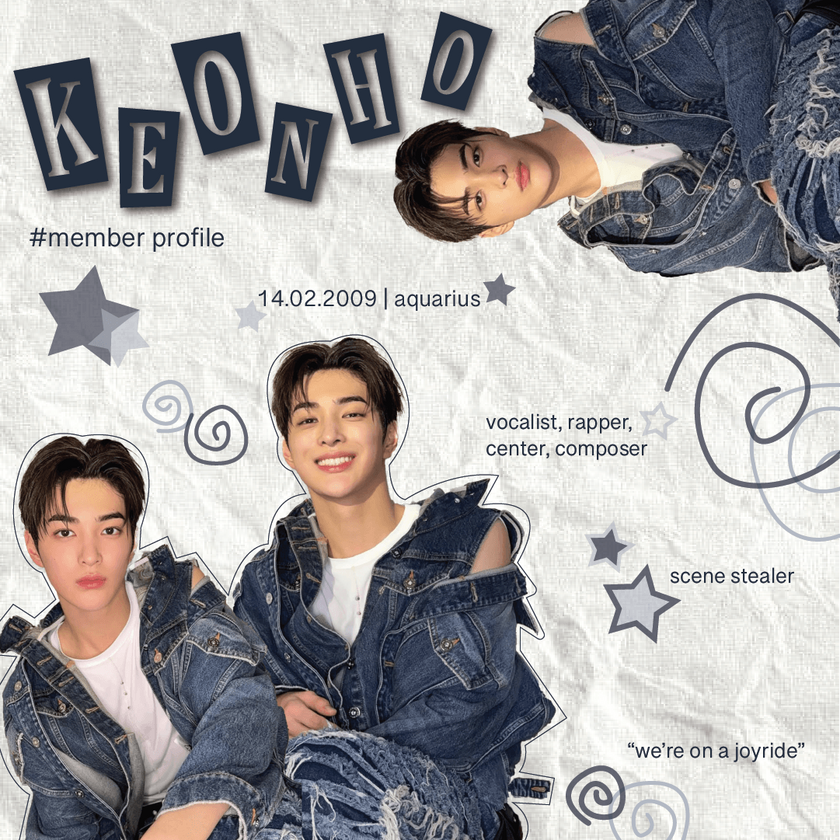
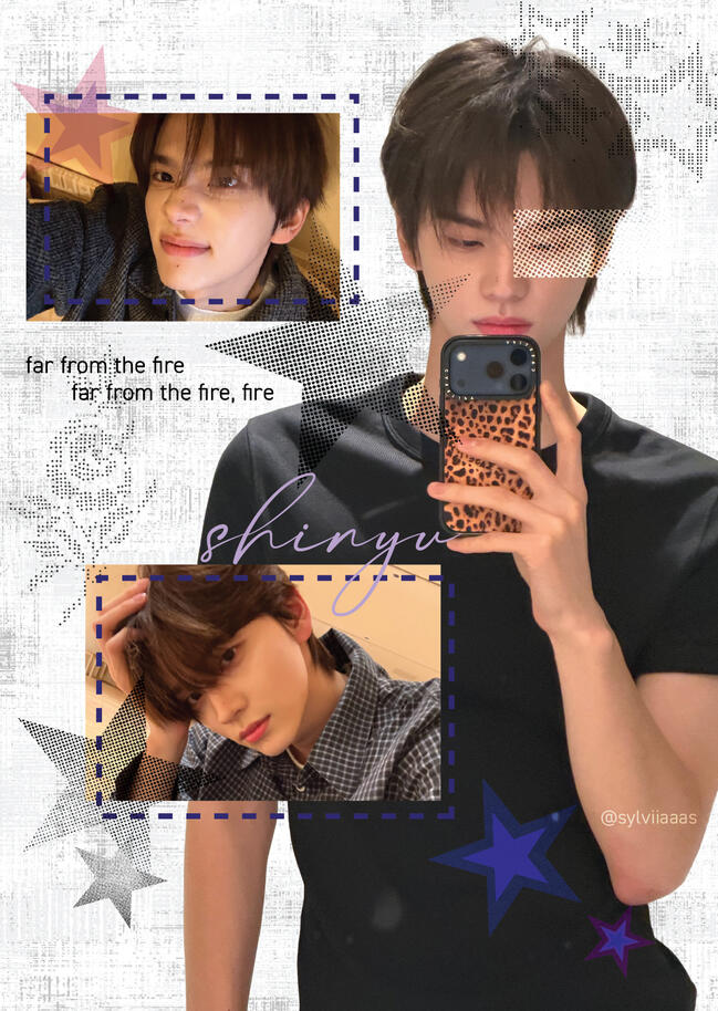
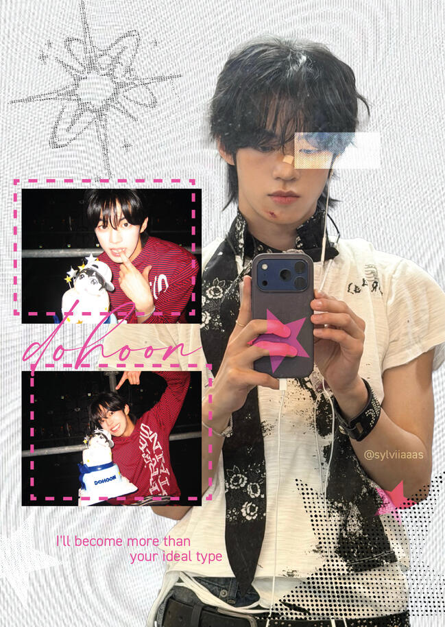
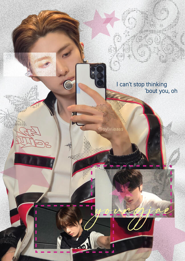
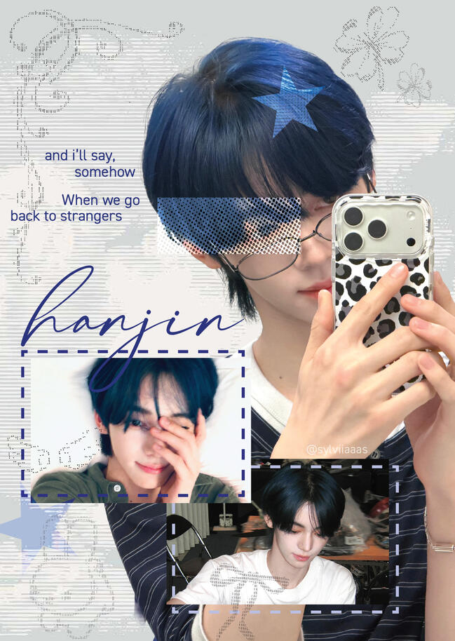
This collection of graphic designs features individual member profiles of K-POP group - CORTIS, exploring each member's personality through a playful scrapbook-inspired aesthetic. Drawing inspiration from editorial layouts and cut-out collage compositions, the designs combine layered photographs, textured paper backgrounds, oversized typography and decorative elements.
While maintaining a consistent visual direction throughout the collection, I experimented with different photo arrangements, typography treatments and graphic elements to give each member's design its own character. The use of contrasting photo scales, overlapping cut-outs and scattered lettering creates a sense of movement and spontaneity, resulting in a cohesive series that celebrates the individuality of each member while bringing the collection together as a whole.
'Movie Type Talks' typography poster design
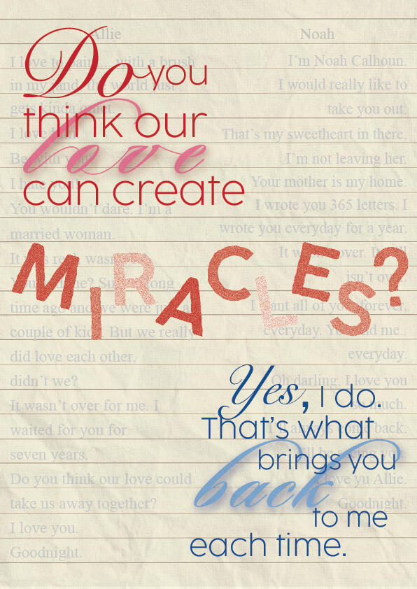
The Notebook - dialogue typography posterThe Notebook follows Noah and Allie, two young lovers separated by social differences and life's challenges. Years later, their enduring love and shared memories reveal the power of devotion and true love.This dialogue between Noah and Allie comes from the film's emotional ending, where the two share one final embrace. As Allie suffers from dementia, she often forgets who Noah is. When Noah says that miracles bring her back to him each time, he refers to the moments when reading their love story helps Allie briefly regain her memories of him. Despite her memory fading, their love continues to find its way back to each other.This poster explores the contrast between handwritten and sans-serif typography, bringing together different styles to reflect the diversity and connection between Noah and Allie. The varying opacity of the word “miracles” symbolises Allie's fading memories, while the paper-textured background references both Noah's notebook and the letters he wrote during their separation.Faint snippets of dialogue from the film are scattered throughout the design, representing how Noah's retelling of their love story keeps their memories alive even as Allie's begin to fade.
Amplify - The Pulse of Pop
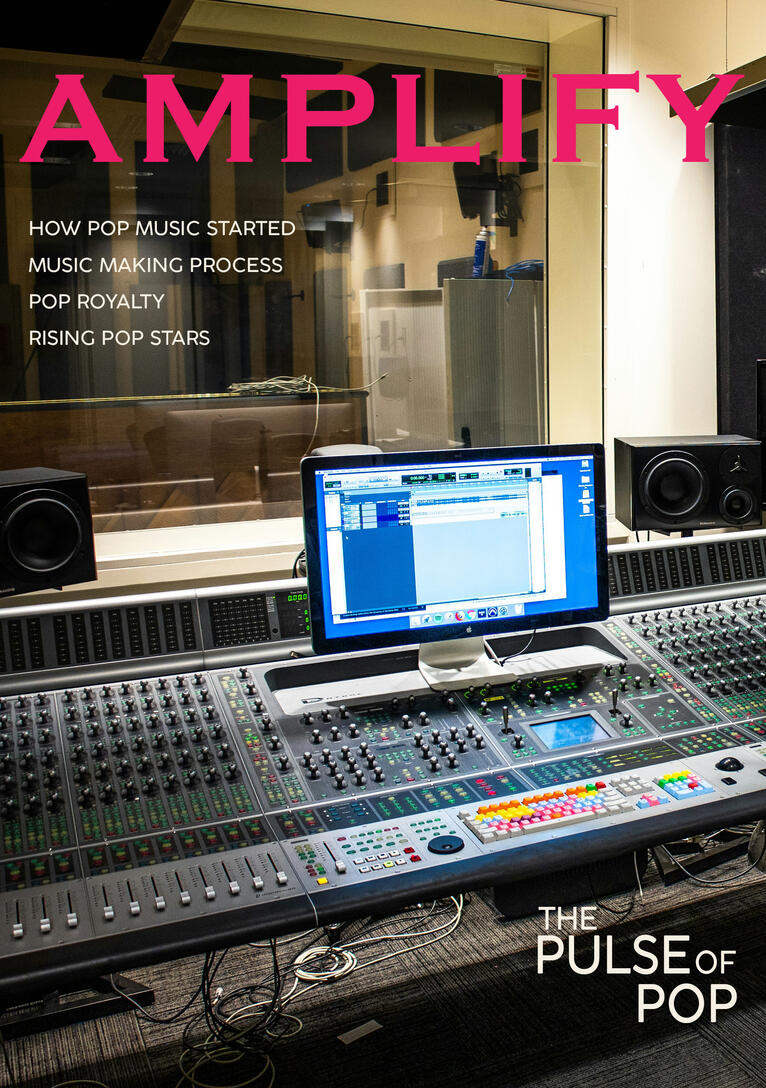
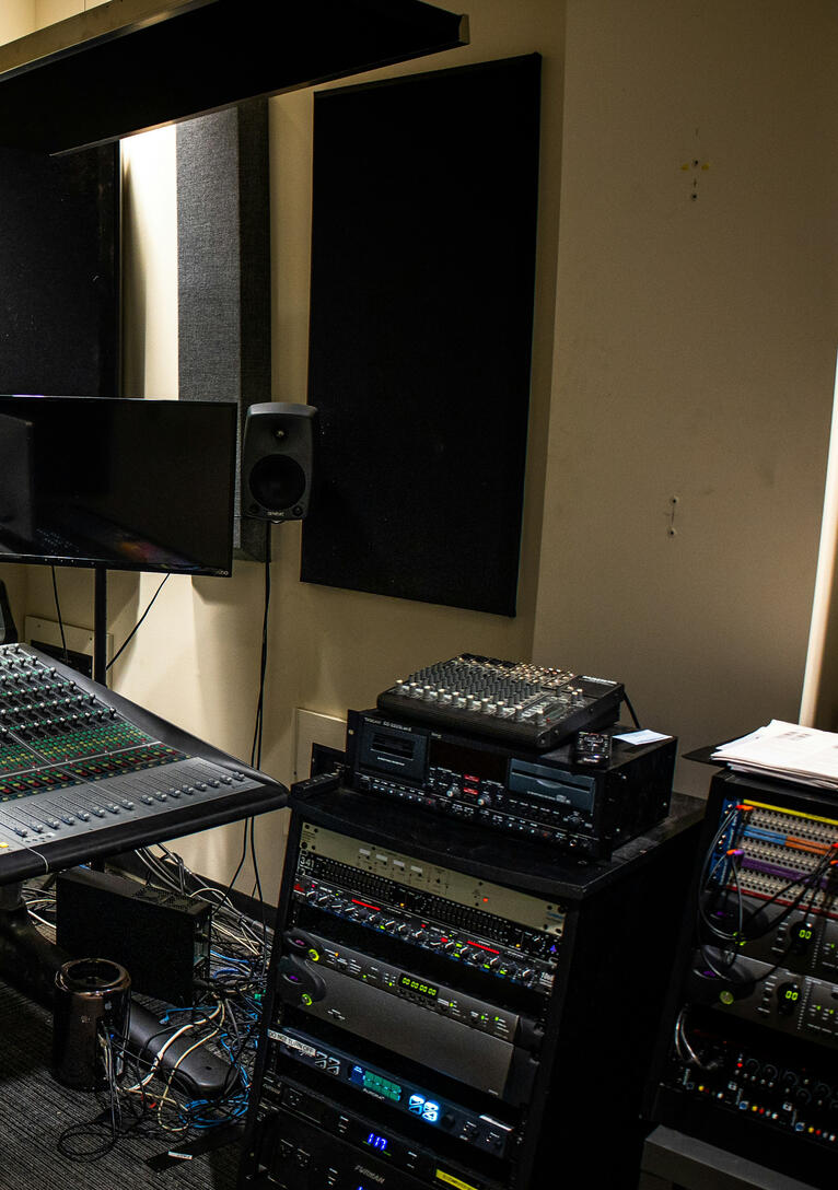
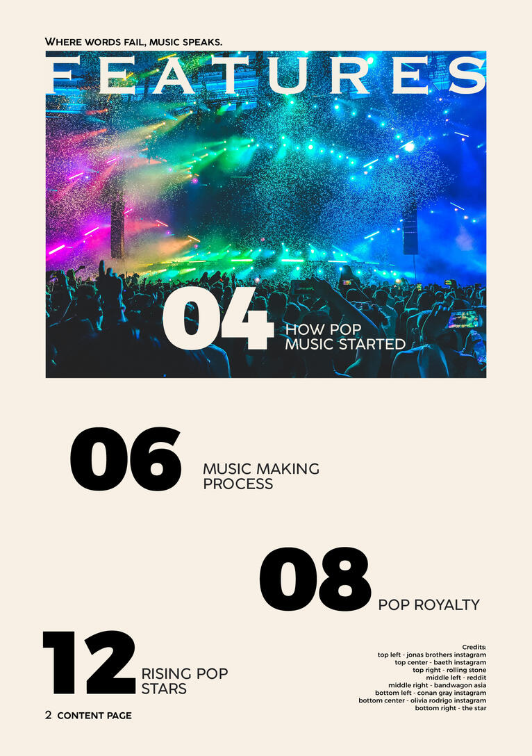
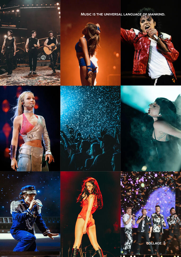
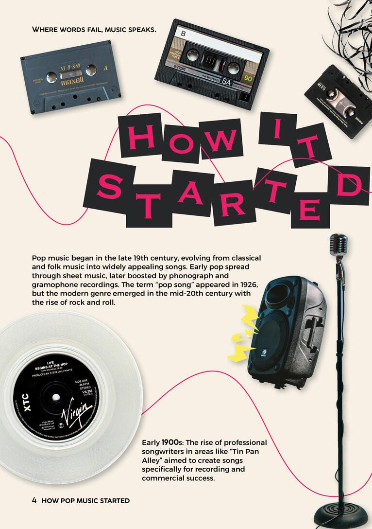
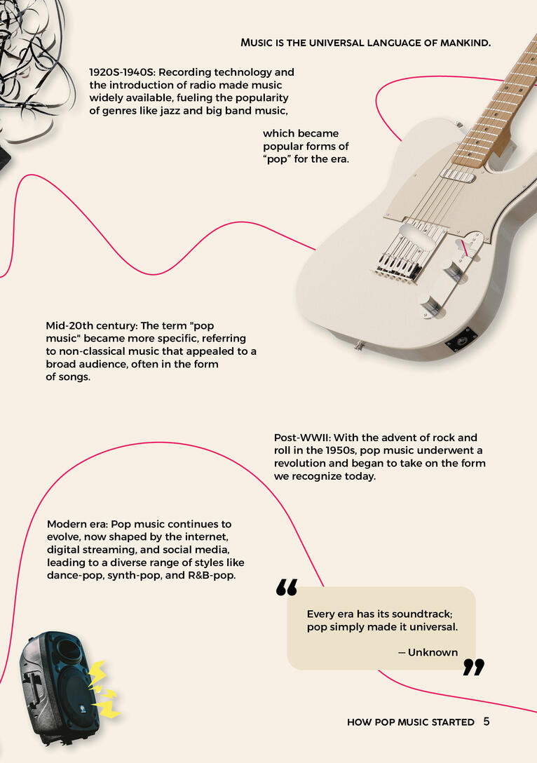
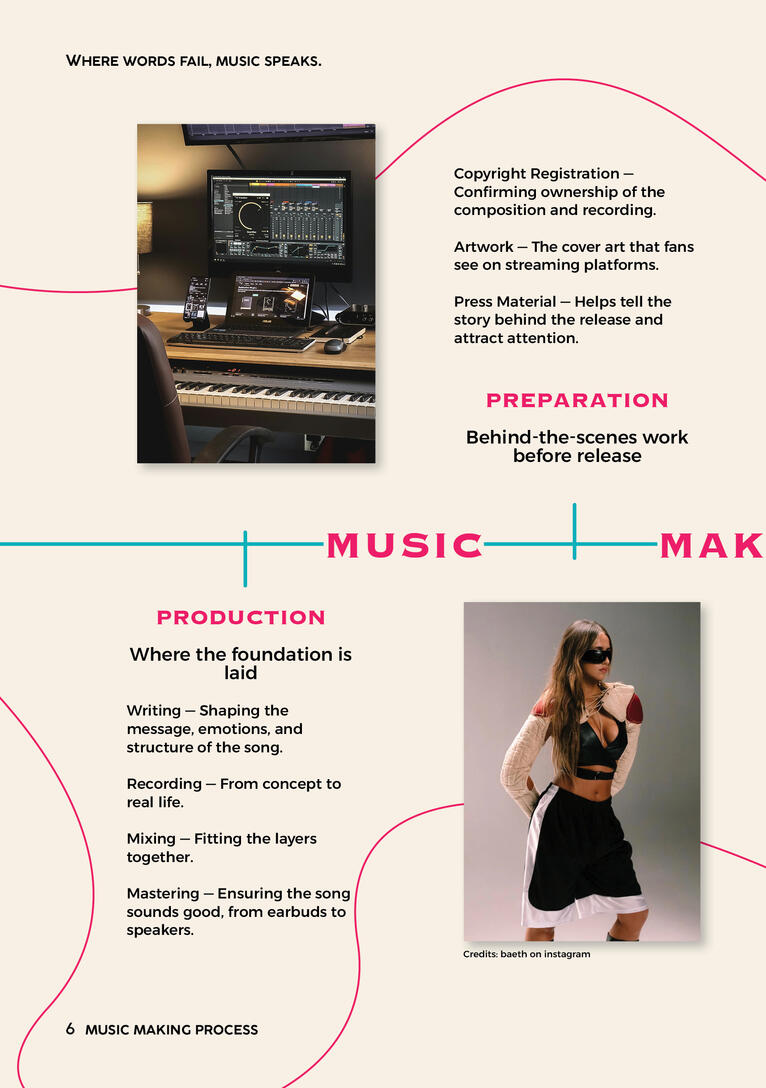
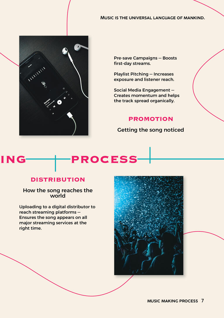
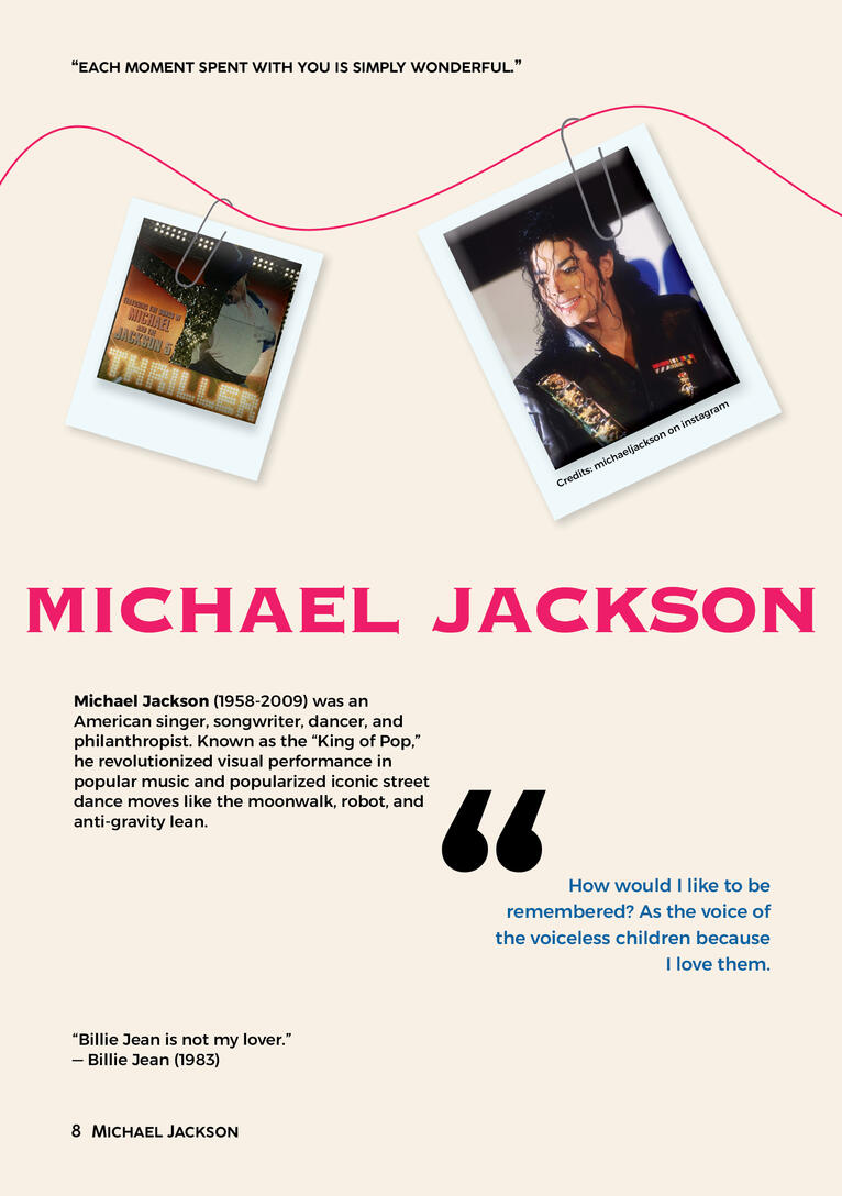
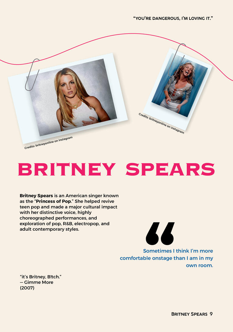

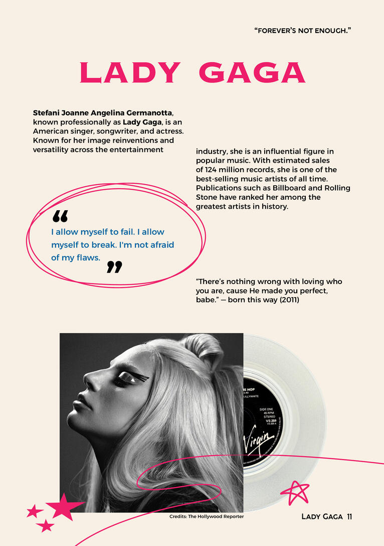
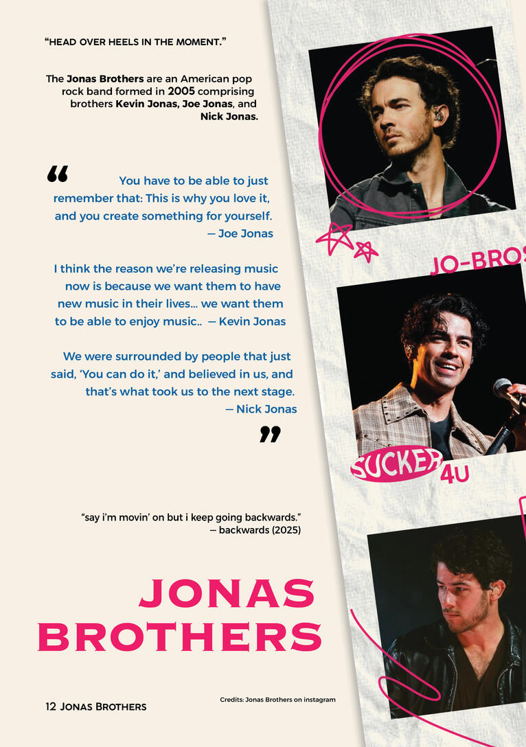
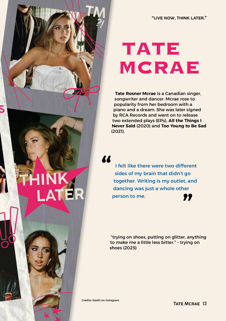
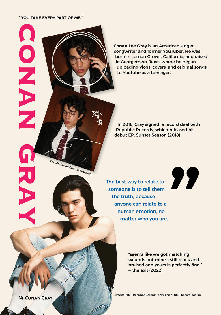
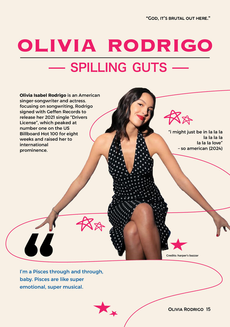
The editorial theme I had chosen for this piece was "pop music evolution" titled 'Amplify'. This piece of work is an interactive 16-page editorial. It tracks the beginnings of music, how it has evolved over time, and icons of every generation.(Warning; LOWER your device volume before opening, Pages 11 & 13 include loud playing music).
Carina de parfum

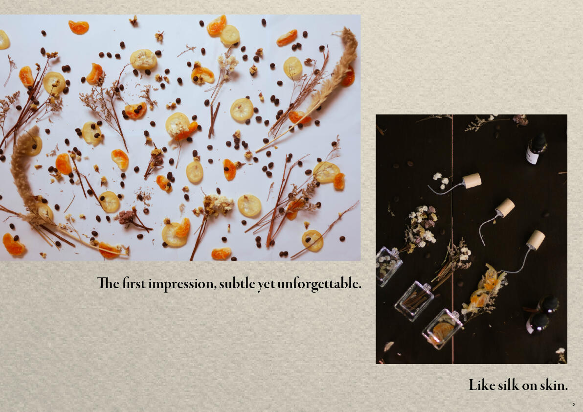
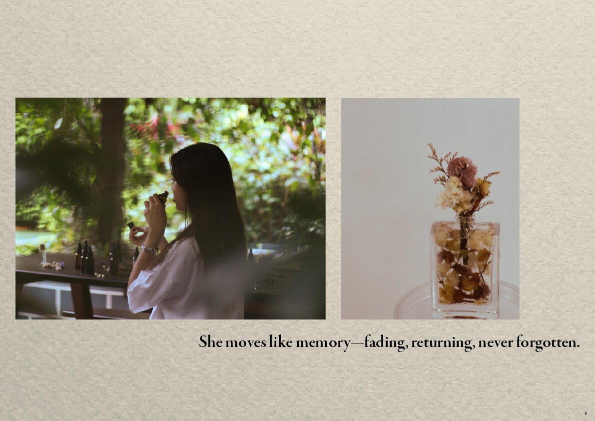
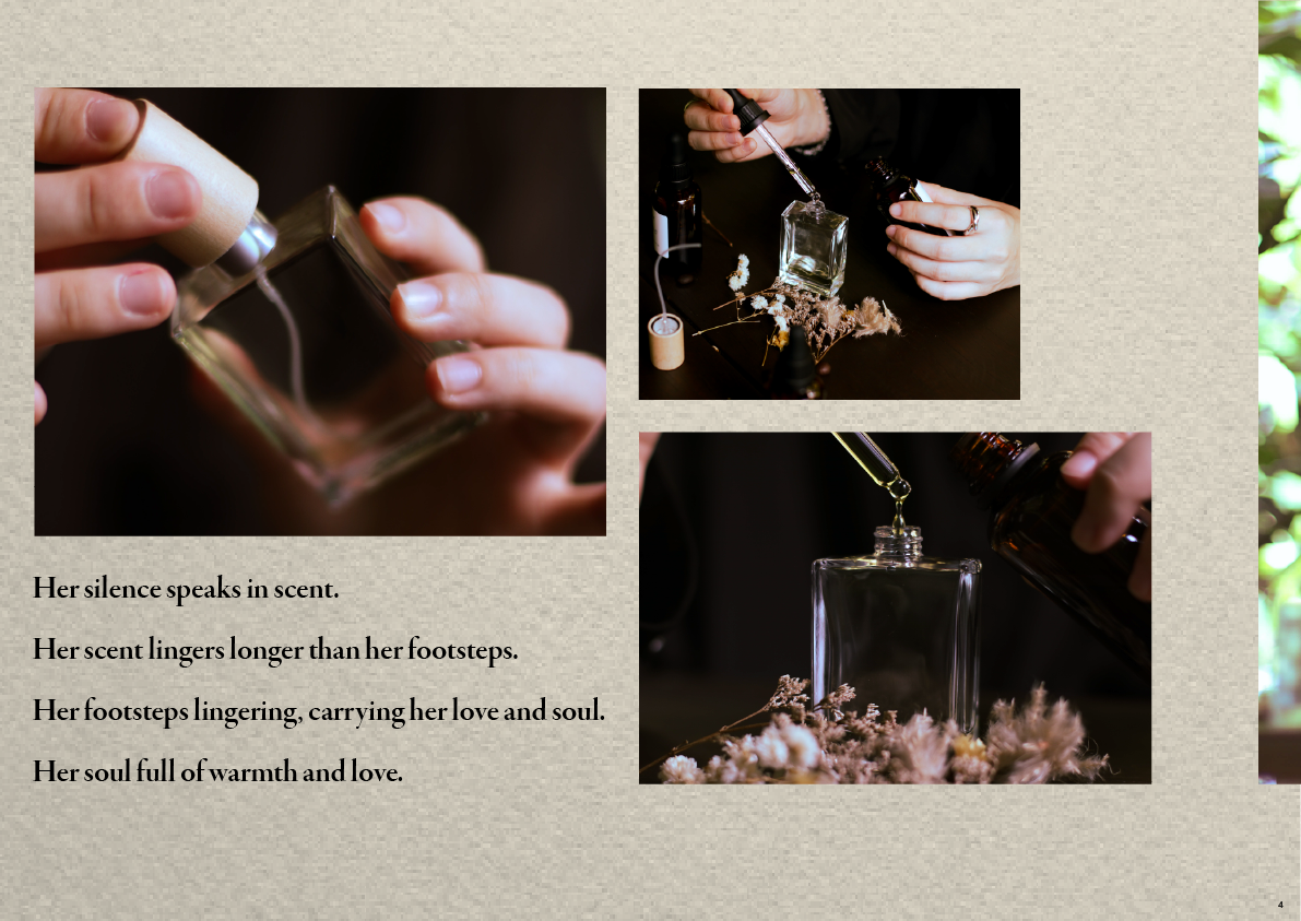
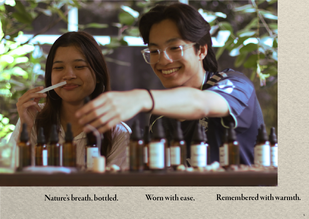
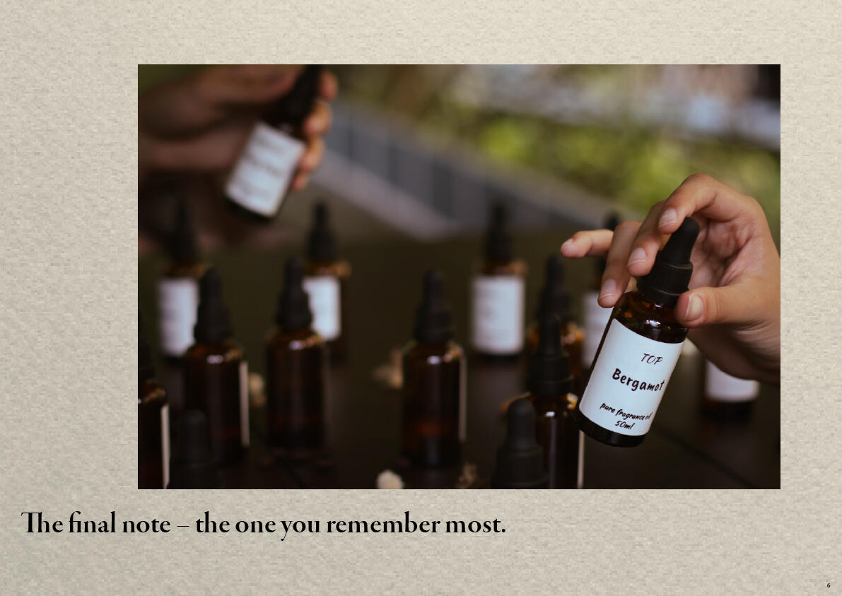
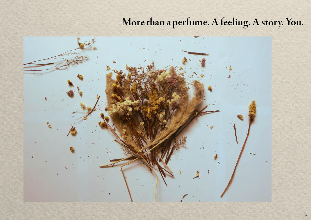

This photography editorial explores the art of fragrance through visual storytelling, capturing the elegance and sensory appeal of perfume. Through carefully composed product shots, lighting and styling, the editorial highlights the perfume's form, details and character. Experimenting with textures, colours and compositions, the photographs aim to translate an otherwise intangible sense of smell into a visual experience, creating an atmosphere that reflects the essence of each fragrance.Special thanks:
Tranyce (hand model)
Eryn (model)
Joshua (model)
Portrait photography
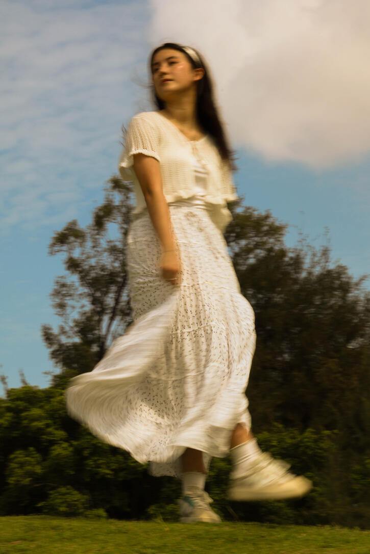
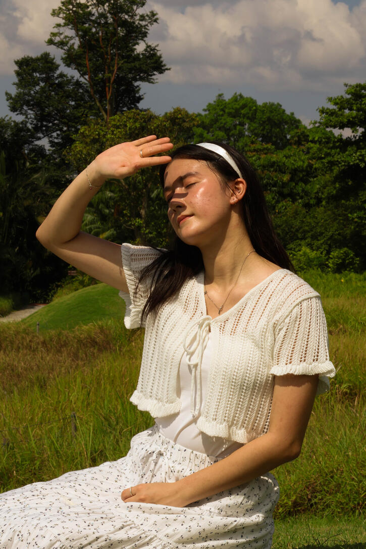
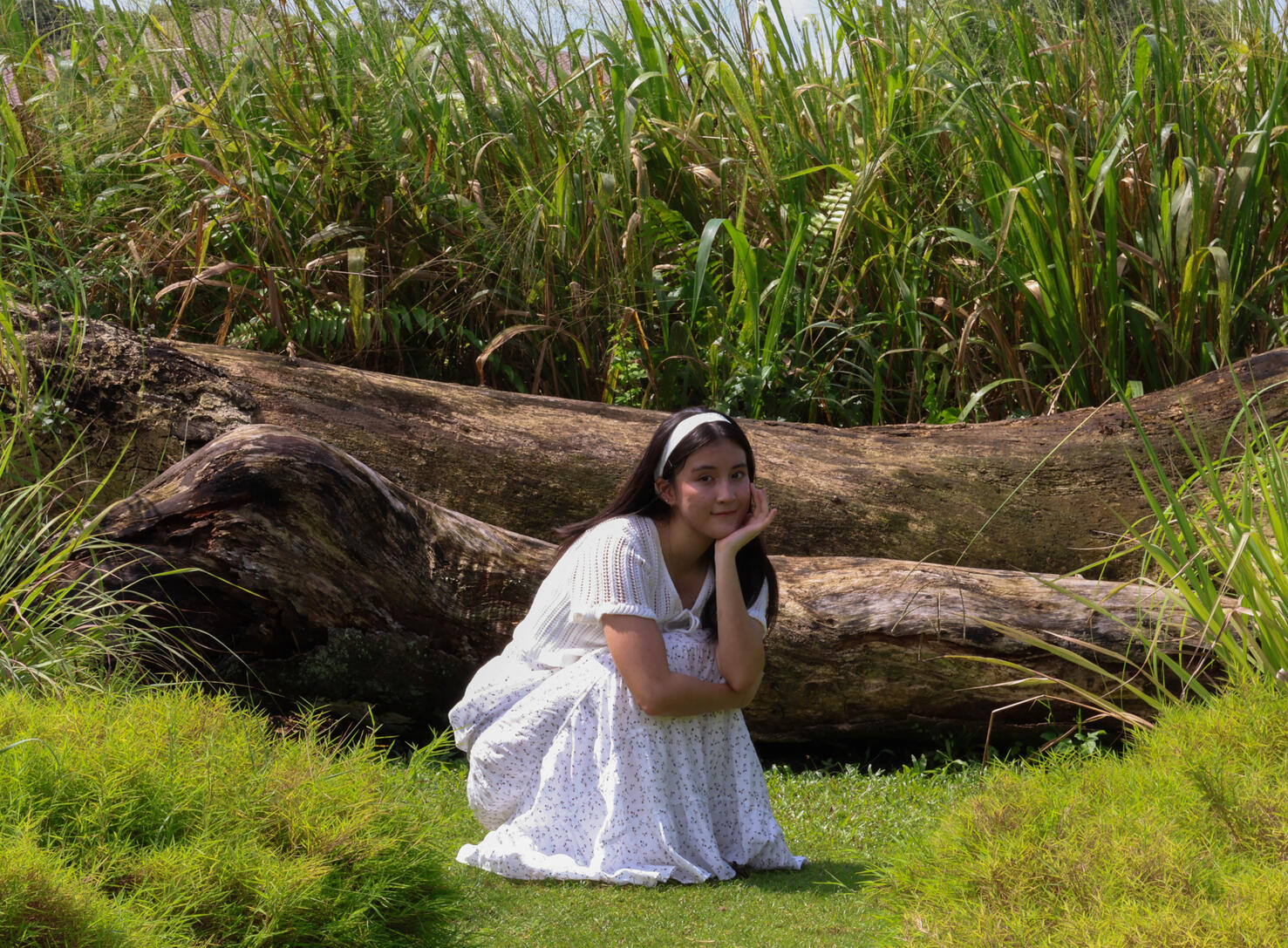
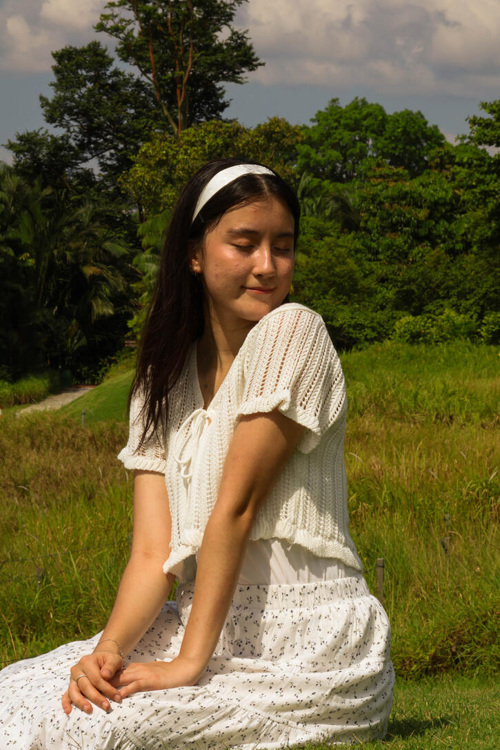
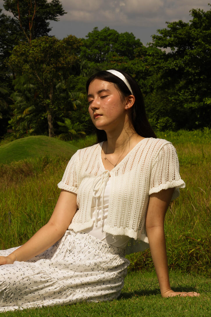
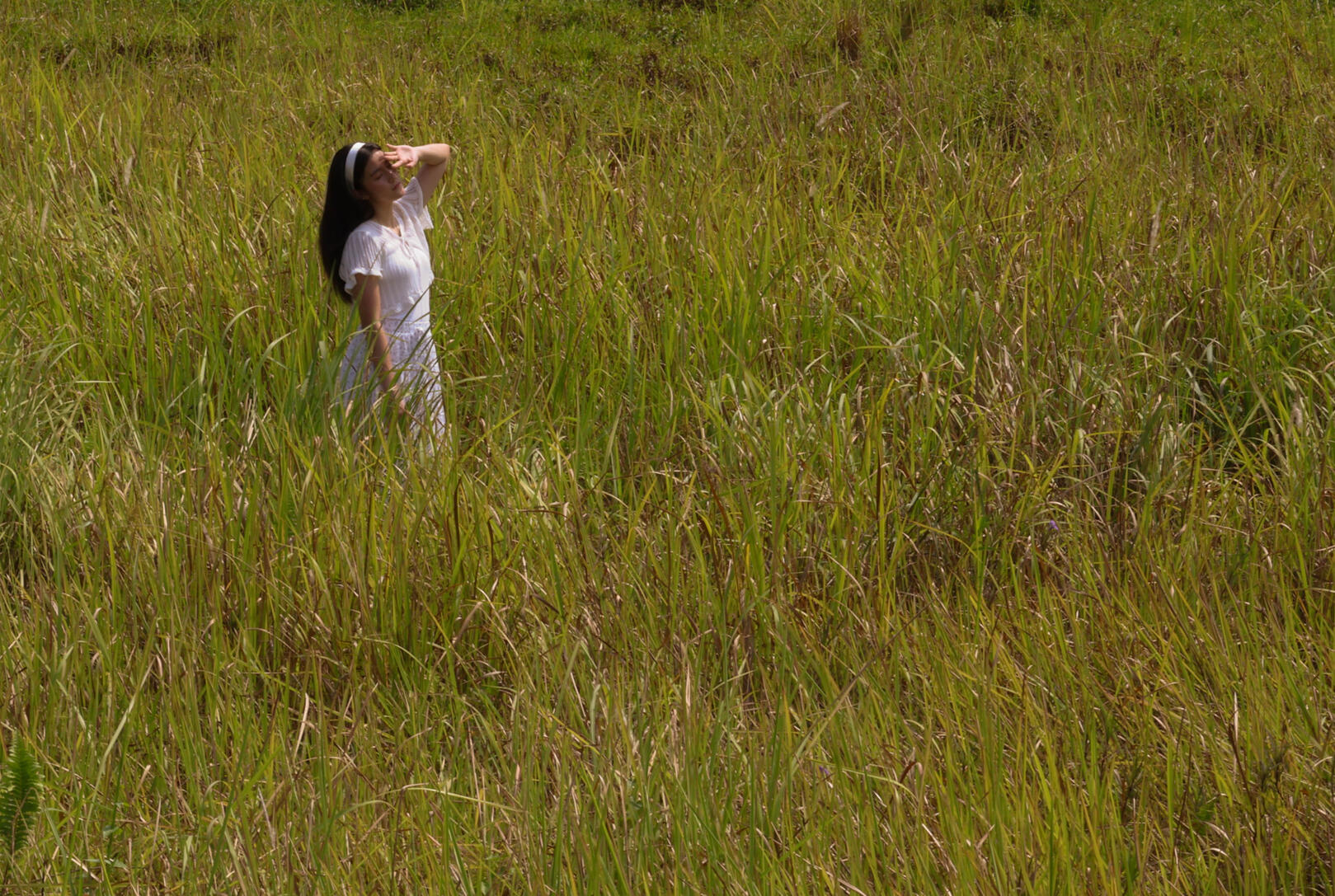
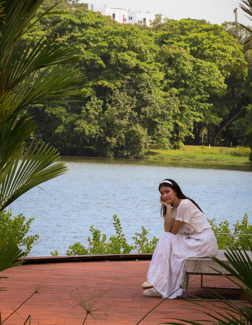
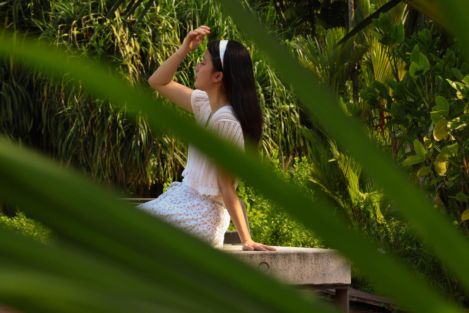
📍: Jurong Lake Garden📸: canon r10 mirrorless cameraSpecial thanks:
Tranyce (model)
Visual photography
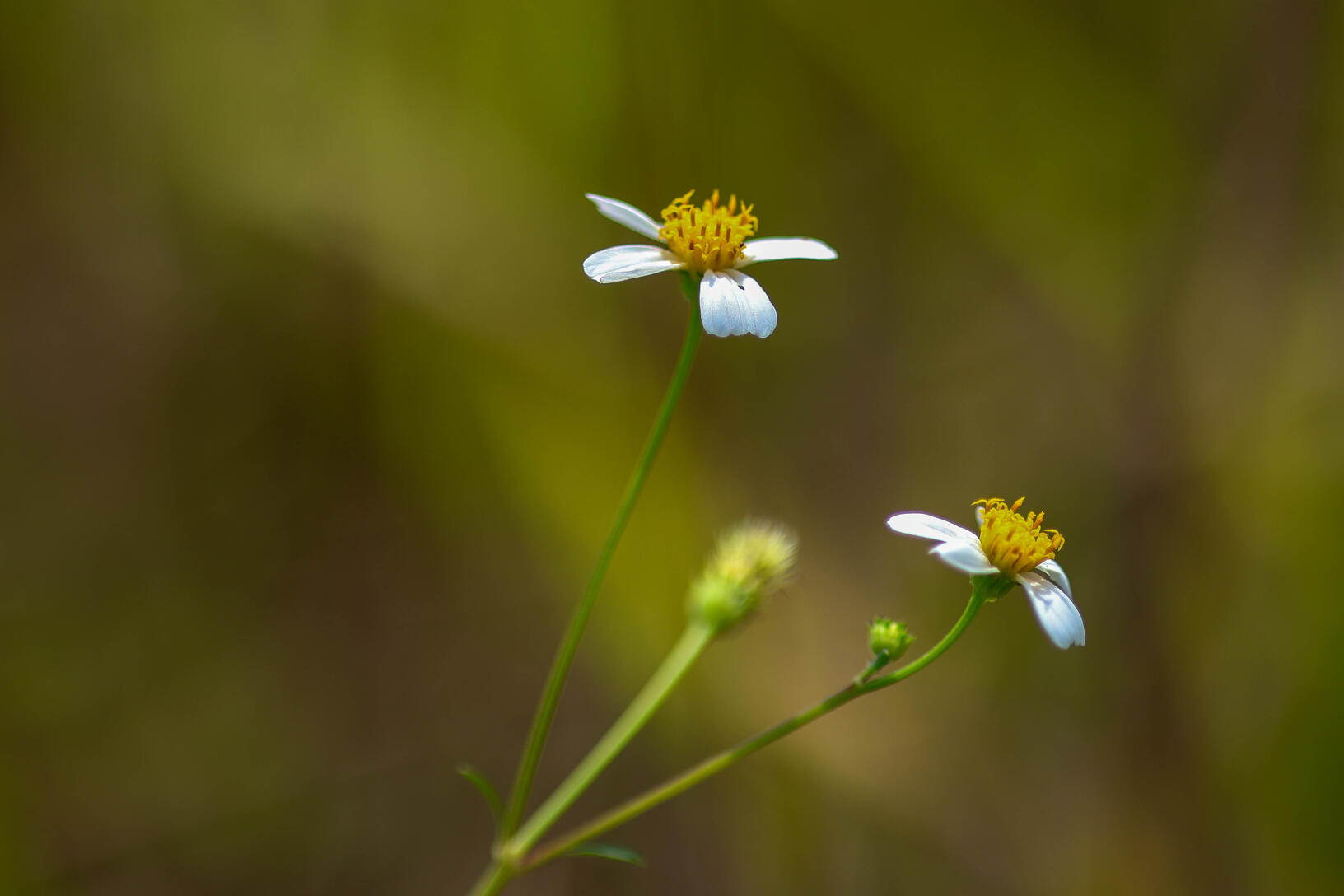
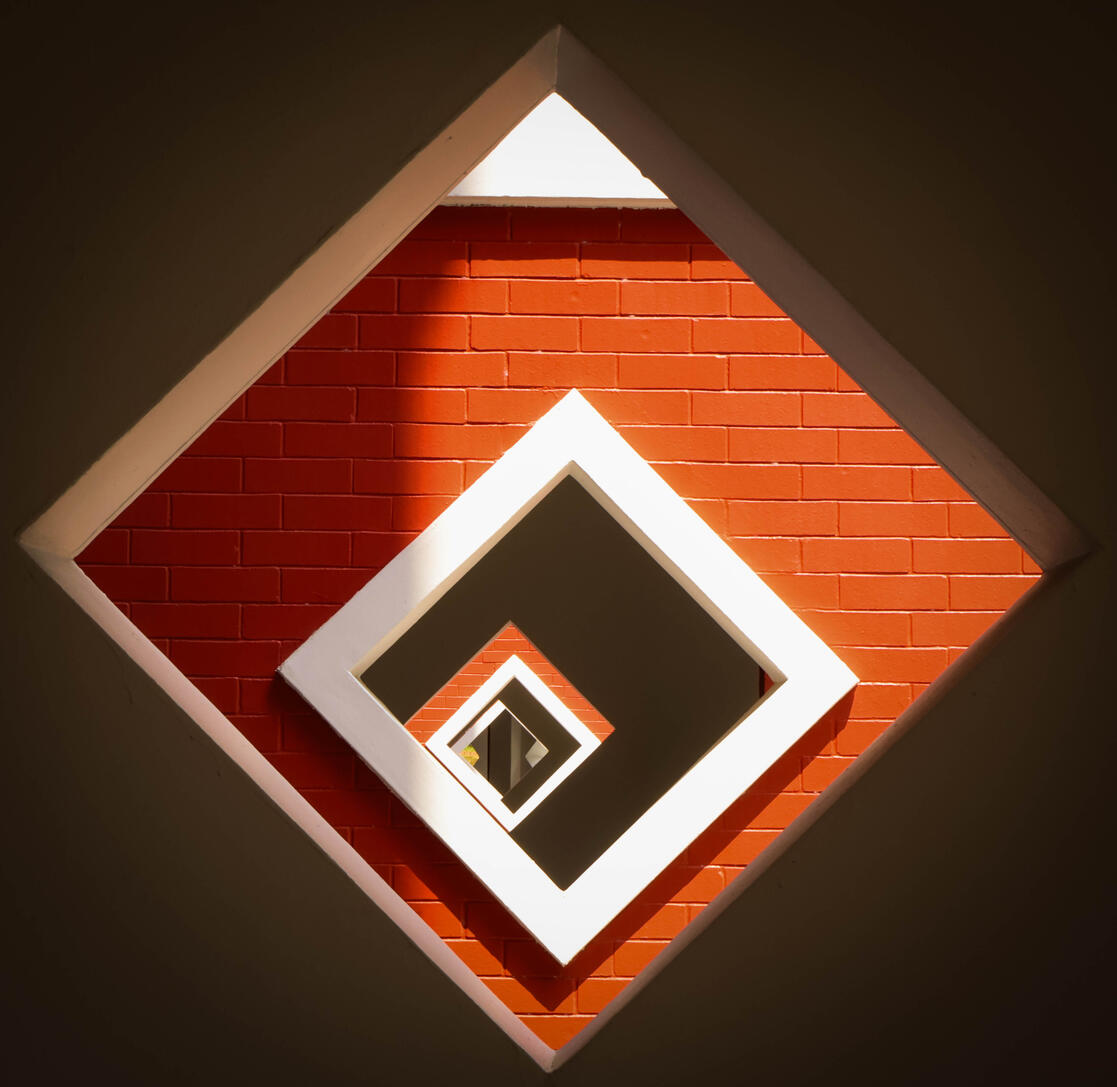
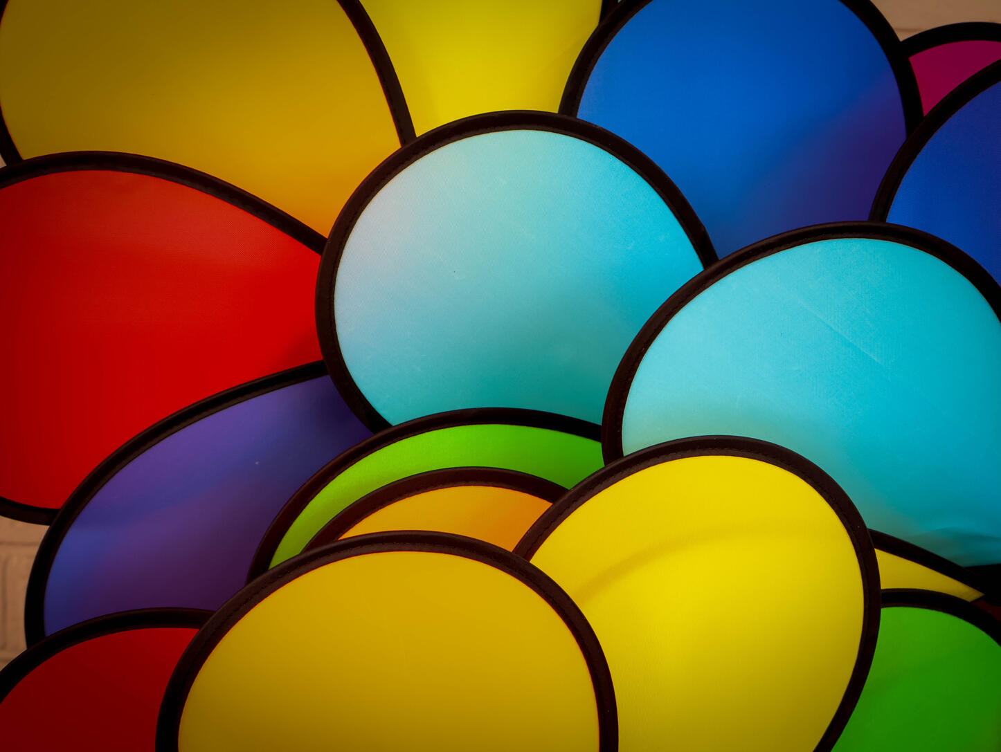
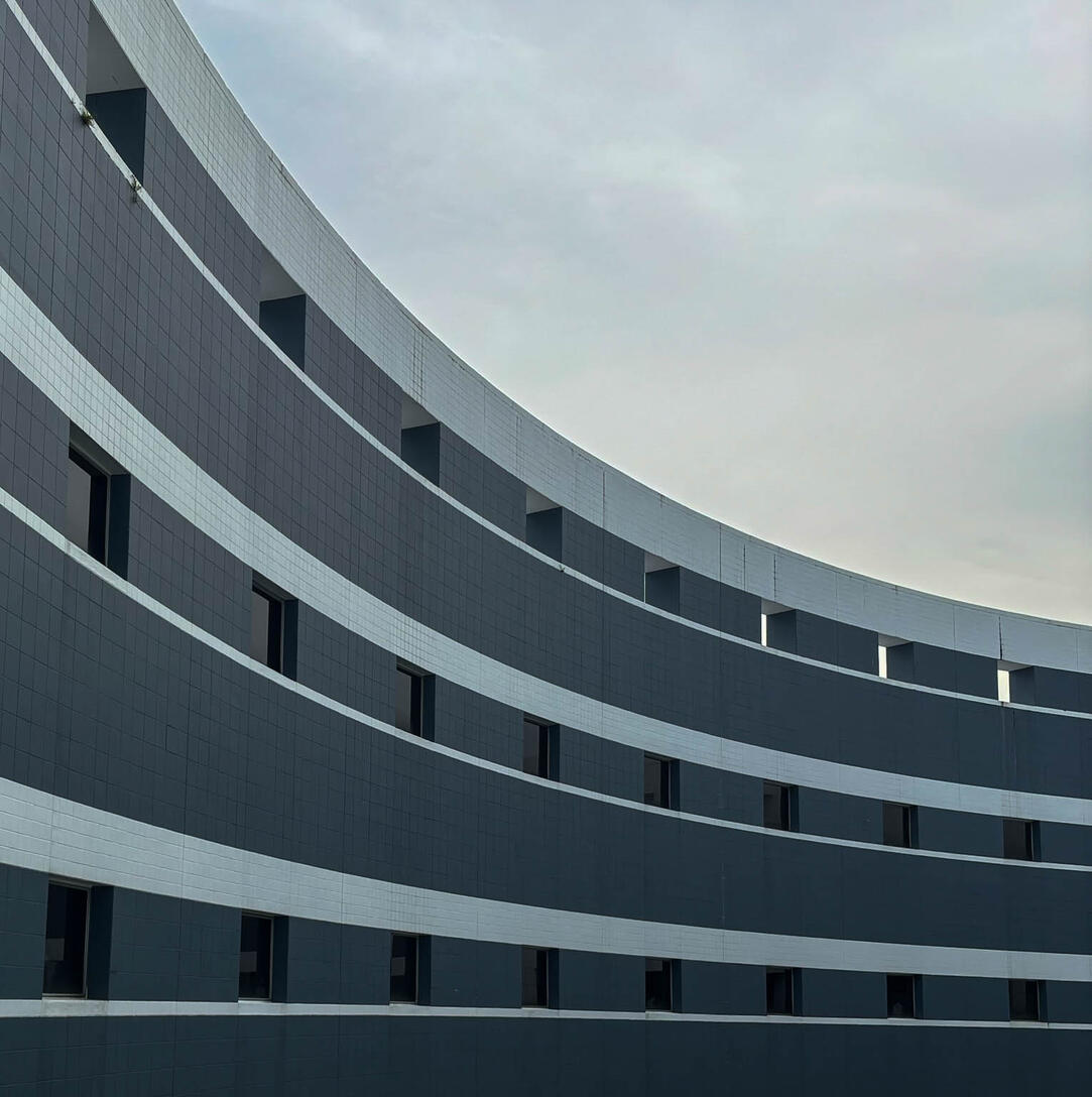
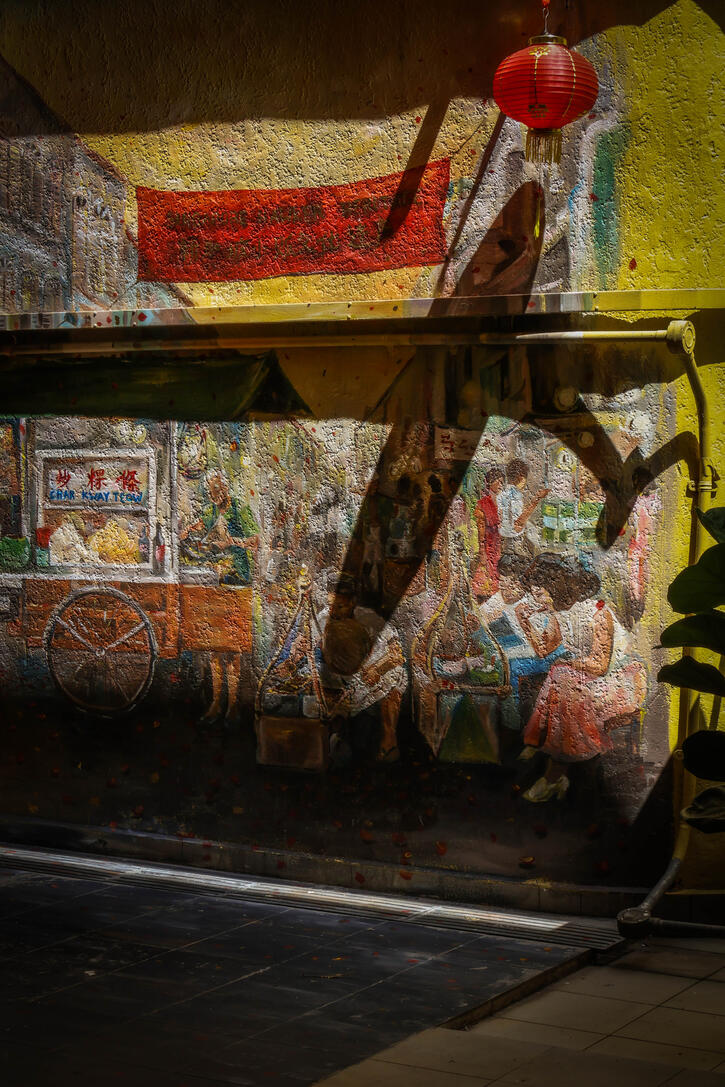
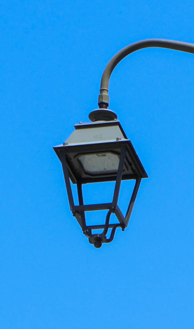
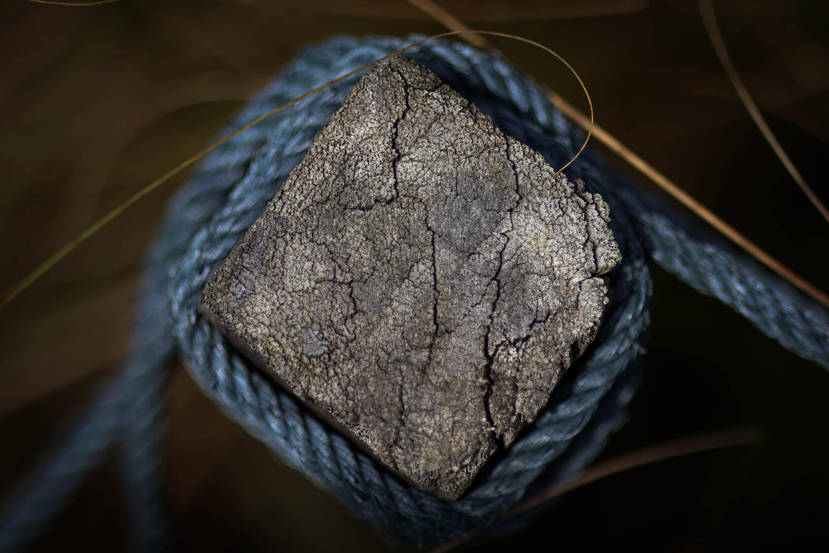
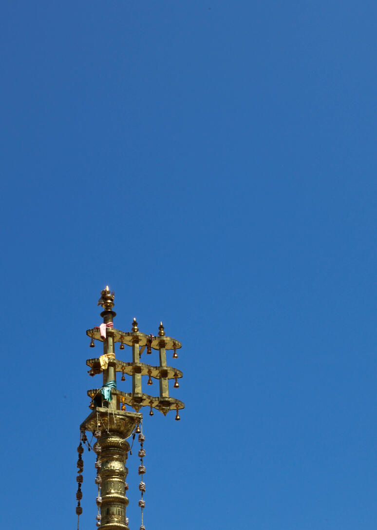
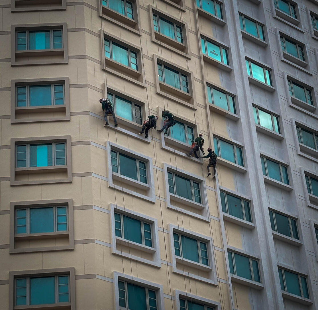

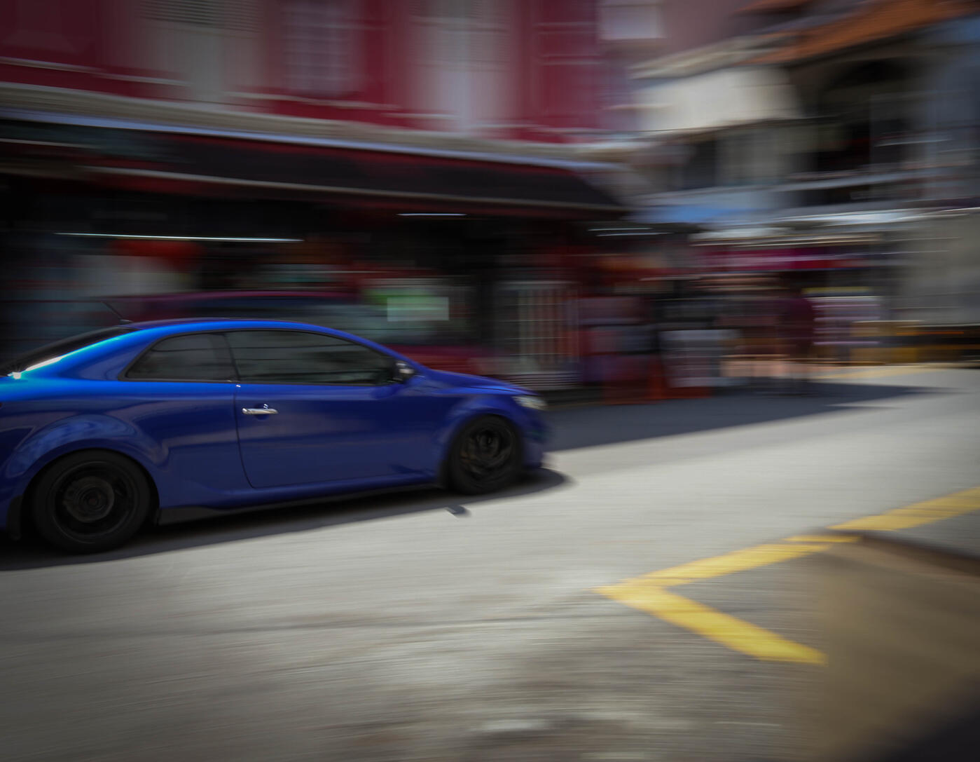
📸: canon r10 mirrorless camera / iPhone 15
Product photography
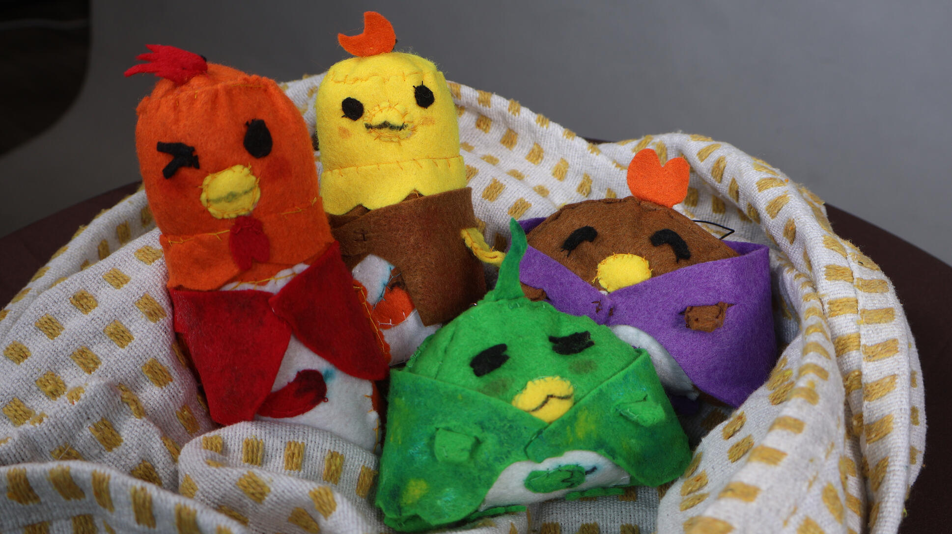
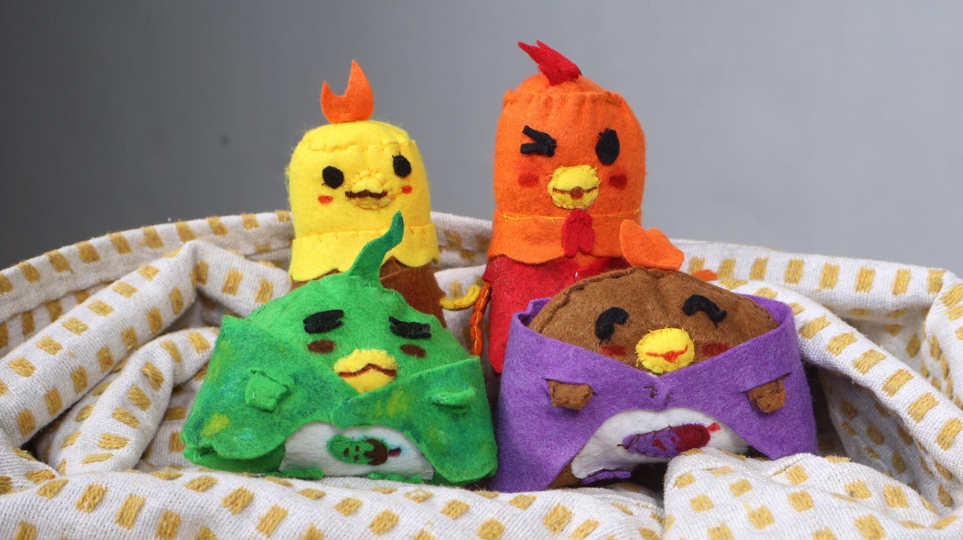
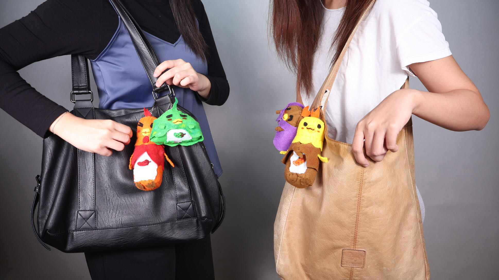
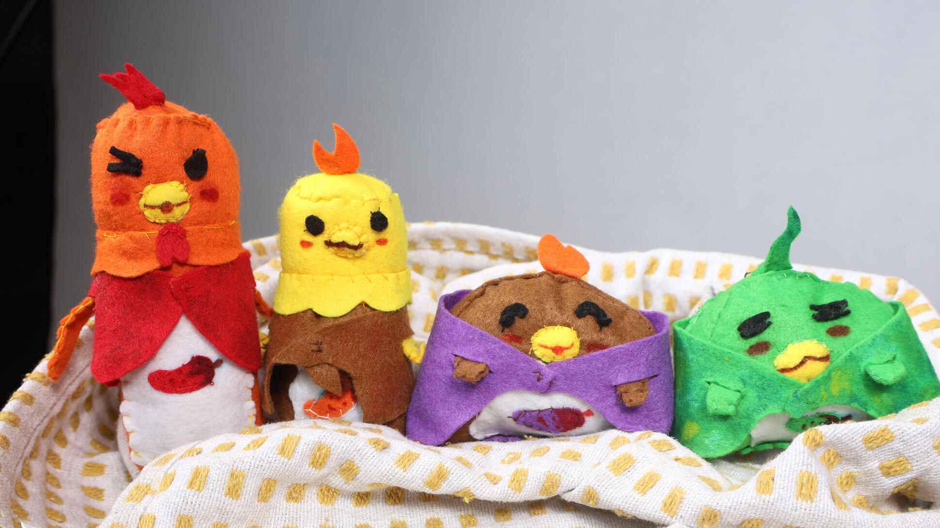
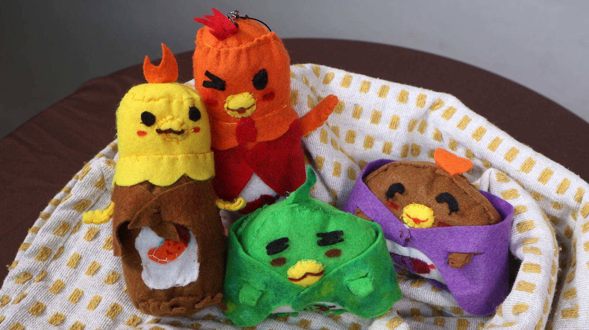
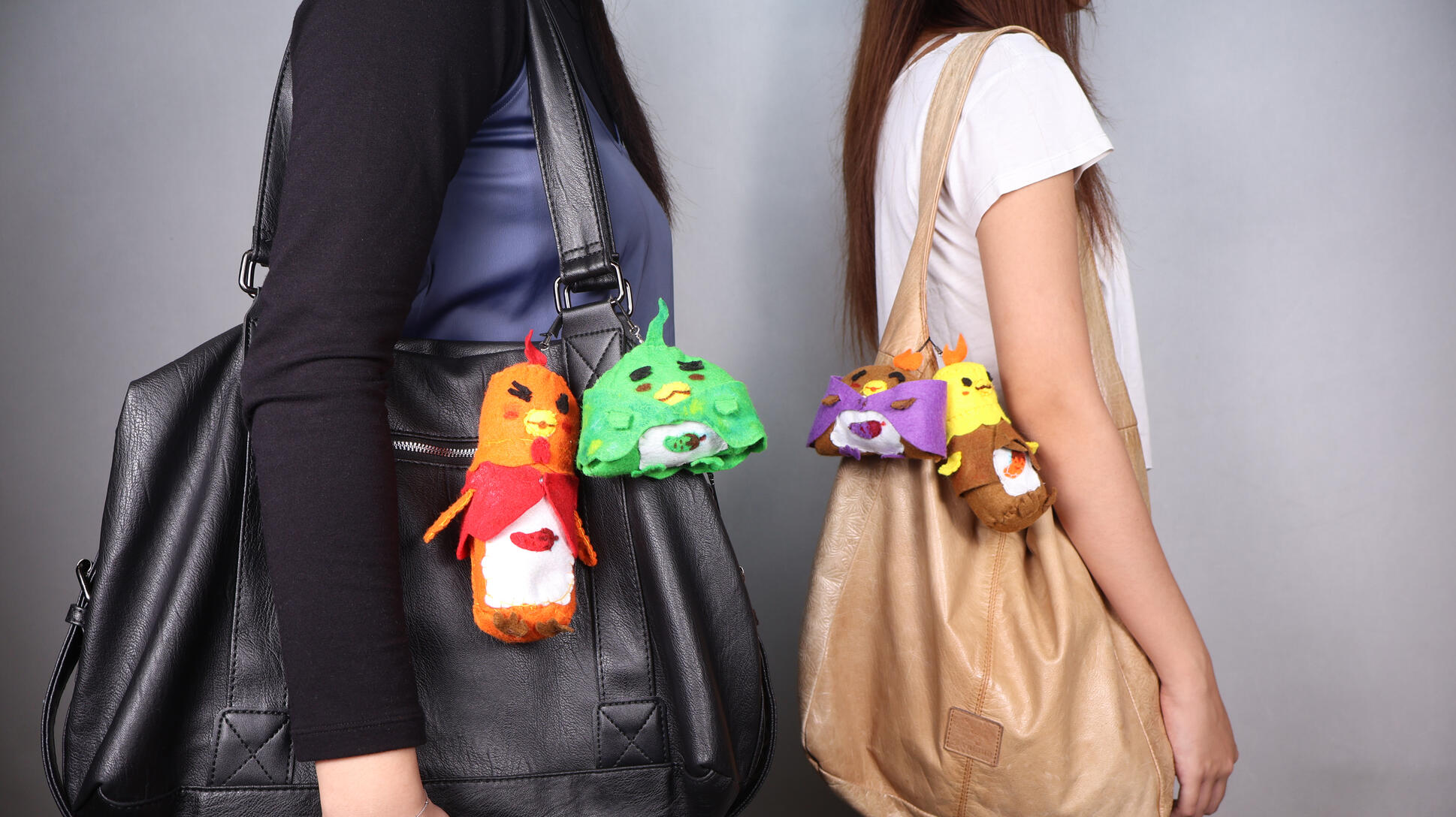
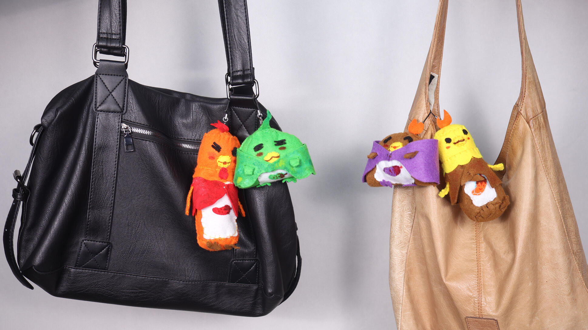
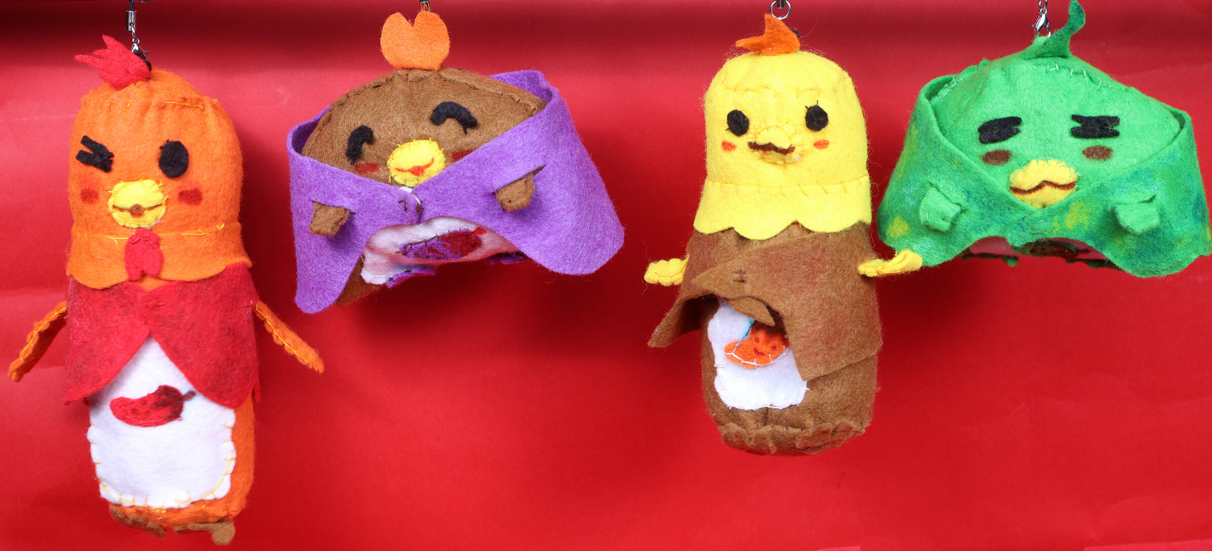
🐥: Product prototype shoot for Nasi Lemak Ayam Taliwang | camera operator & set design📸: canon r10 mirrorless cameraSpecial thanks:
Tranyce (model & product curator)
Eryn (model)
Food photography


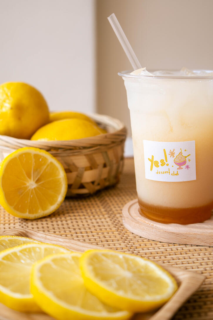
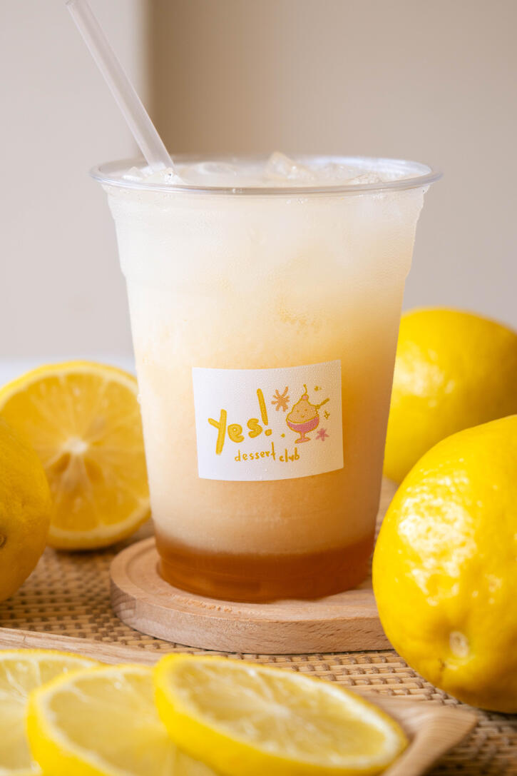
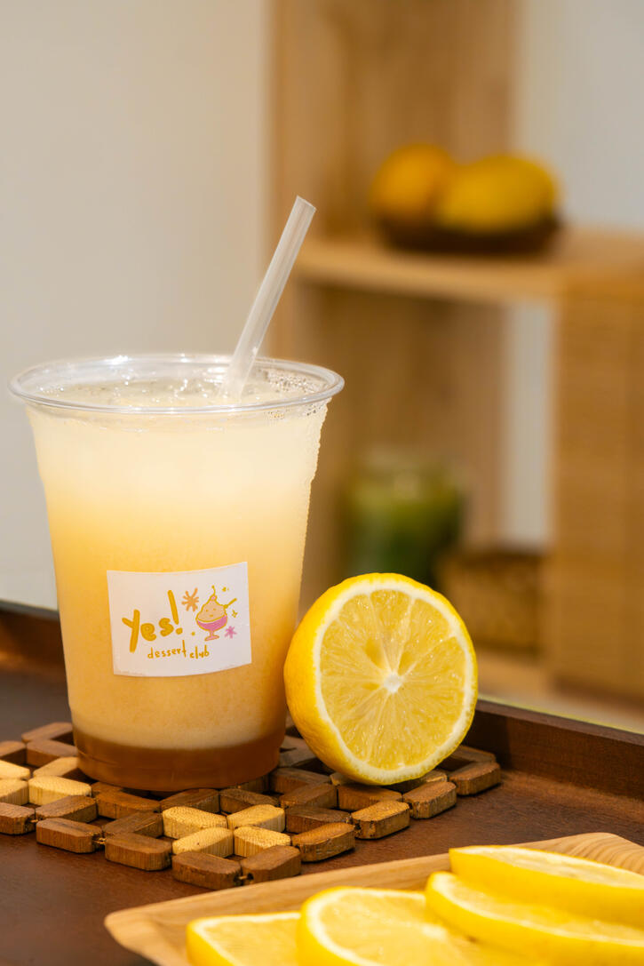
🍋: Food photoshoot for Yes! Dessert Club - Yuzu yogurt soda | camera operator, set design & food styling📸: canon r10 mirrorless camera


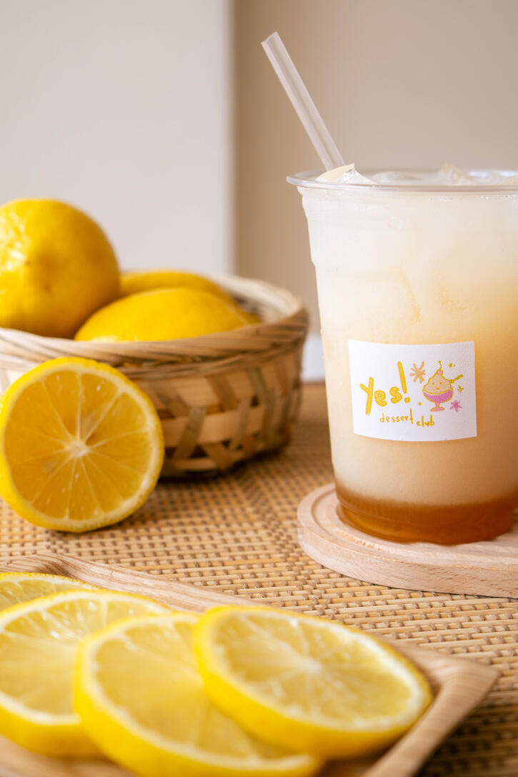
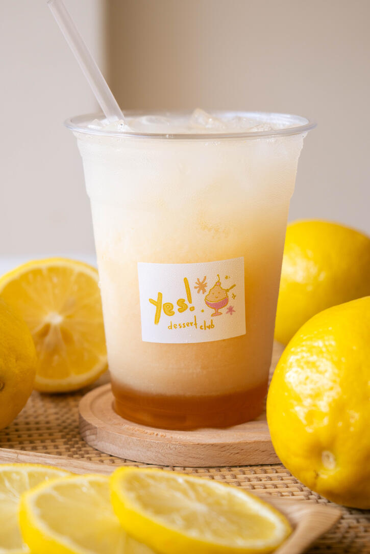
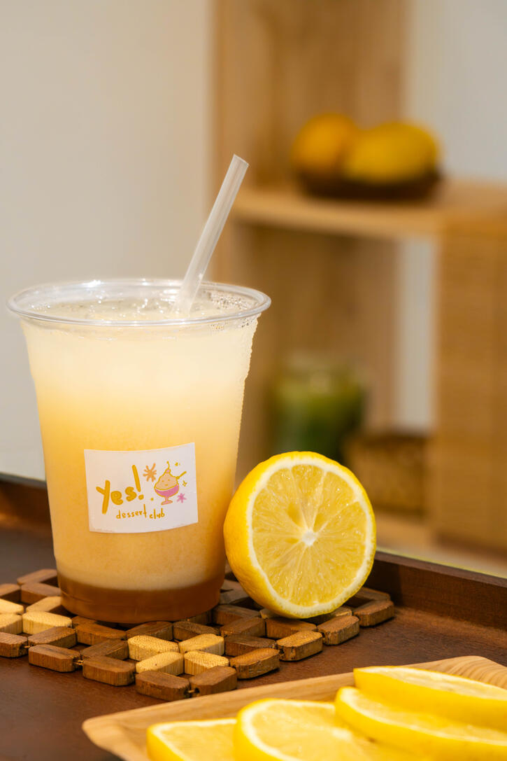
🍋: Food photoshoot for Yes! Dessert Club - Yuzu yogurt soda | camera operator, set design & food styling📸: canon r10 mirrorless camera